
August 2, 2016


Your website is one of your business’s most important assets. As the digital storefront and face of your company, it does a lot of heavy lifting. Maintaining and improving your site regularly is a best practice for any business owner. But creating excellent written content and beautiful images might be a futile effort if your site isn’t easy to use for visitors. Putting your best foot forward requires careful thought about usability, and one of the most important features of a functional site is responsiveness.
Responsive web design means that your visitors will be able to view and interact with all the content on a site, regardless of what device they’re using. As Google defines it, a responsive site “uses the same URL and the same code whether the user is on a desktop computer, tablet, or mobile phone – only the display adjusts or “responds” according to the screen size.” With responsive design, text, images, videos, and any other content you have on your site will show up on the user’s screen in an easy-to-use format- no scrolling, pinching, or zooming necessary.
Taking the time to ensure that your site is fully responsive creates a better experience for multi-device users. Since people are increasingly using phones for almost all their internet use throughout the day, multi-device users likely make up a majority of your site’s visitors. A site that requires a lot of finagling and effort to use on a mobile device can be a major detriment. At best, your visitors will be frustrated; at worst, they’ll just stop visiting your site altogether, or visit your competitor’s site instead. A challenging site may well translate to lost business.
In addition to creating a good user experience and establishing a positive relationship with site visitors, responsiveness is an important factor in a good SEO strategy. As of last year, Google uses mobile friendliness as a ranking signal. Responsive sites are rewarded, which means that non-responsive sites are functionally penalized.
One alternative to a responsive design is to create a separate mobile site. While having a mobile site is better than nothing, this solution has started to fall out of vogue, and for good reason: having a separate mobile site in addition to a desktop site is a real hassle. Google notes, “creating separate mobile URLs greatly increases the amount of work required to maintain and update your site, and introduces possible sources of technical problems.” Mobile sites also often have less functionality or reduced content than their desktop counterparts, which can be frustrating for visitors who regularly use both versions.
Starting with a responsive design from the beginning means that you’ve created your site with your user’s experience in mind. It’s also more fluid, so you’ll be able to optimize for new devices and screen sizes as necessary. When you make changes to your responsive site, you only have to make them once, instead of working on the desktop and mobile sites separately.
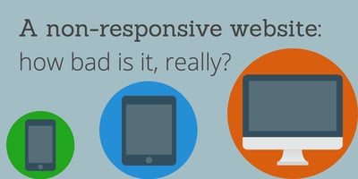
So how bad is it to not have a responsive site?
Verdict: REALLY BAD!
Having a site that all of your customers and prospects can use on any device is crucial in order to provide value to them. Responsiveness is really only the first step; it’s wise to always look for ways to improve your website based on how your visitors are actually engaging with it. To learn more, check out our ebook on growth-driven design.


Search The Site.