In an inbound marketing campaign, there is one small unsung hero: the CTA.
It’s easy to overlook this humble button. After you’ve spent a lot of time and effort developing interesting and useful offers, writing blog posts that help solve your audience’s most pressing issues, and creating great landing pages, that last step- a CTA button- can feel like an easy little afterthought.
But neglecting your CTAs could be a big mistake.
A call-to-action, or CTA, has one job: to take visitors from a site page or blog post to a landing page. It’s a simple enough task. Think of a CTA as the gateway from a blog post or site page to a landing page, where strangers become contacts. That’s a pretty important step in the inbound process.
So what makes a CTA effective?
It should be easy for your visitors. Easy to find, easy to read, and easy to understand. Here are some tips to consider when you’re building your next CTA.
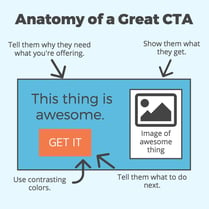
- Ask yourself: is this offer relevant to the purpose of the page it’s on? If it’s at the end of a blog post, does the topic of the offer align with the topic of the post?
- Put your CTA in a logical place for your reader. This is often at the end of a blog post, but it could also be in a sidebar, in your site’s navigation, or smack dab in the center of your homepage. Just make sure you take the time to think about what makes most sense for this particular offer before placing your button.
- Visually, your CTA should stand out from the background. One great way to do that is by using a contrasting color. Another thing to check for: is the size appropriate? It should be big enough to see, but not so big as to be distracting or obnoxious.
- Use an easy-to-read font in a size that’s big enough to read, and consider using a contrasting font color so that the words really pop.
- Your CTA may also be a good place to remind your visitor why the offer is worth their time. As with all the copy on the button, however, keep it very brief.
- If appropriate, include an image of your offer, such as the cover of an ebook, or a photo of a webinar speaker.
- If you’re not pleased with your click-through rate on a CTA, consider doing some A/B testing to see what factors make a difference. Sometimes there will be a simple fix that could make a big difference. Always remember to only change one thing at a time; that way you’ll know for future CTAs which factors make a difference on your site.
That’s all pretty doable, right? If you follow these guidelines, your CTAs will be ready to start helping you turn your website’s visitors into prospects.